DATE↓
STORY TYPE↓
AUTHOR↓
The German company’s head of design translates its classic philosophy for the modern world.
On the side of the Braun BC22 alarm clock, there is a flat, racetrack-shaped slider. Move it up with an easy swipe of the thumb, and a slip behind the clock’s transparent front face moves upward, revealing a green backing behind a small circular cut-out next to the word “alarm.” The clock will sound tomorrow morning. Slide it down, and the white slip makes the green dot disappear. Silence. For Oliver Grabes, Braun’s head of design, it’s details like these—almost rudimentarily simple—that lie at the heart of a Braun product.
When Grabes joined Braun, in 2009, though, the company had veered away from such straightforward, inspired moves. An experimental phase in the ’90s and early 2000s had taken the company into trendier waters, producing more complex designs that didn’t have a uniting set of values. Grabes saw it as his role to steer the company back to its roots.
This wasn’t, however, an exercise in producing vintage knockoffs or retro designs. For Grabes, that’s not what Braun is about. Fittingly, the approach he developed with the Braun design team became known as “Past Forward”: learning from the past, distilling it into a set of values, and using those to iterate designs for the present that could last well into the future. The guiding principles—reduction, symmetry, balance—of the “Past Forward” strategy have come to dictate how a Braun product is designed, even resulting in a new typeface, Braun Linear.
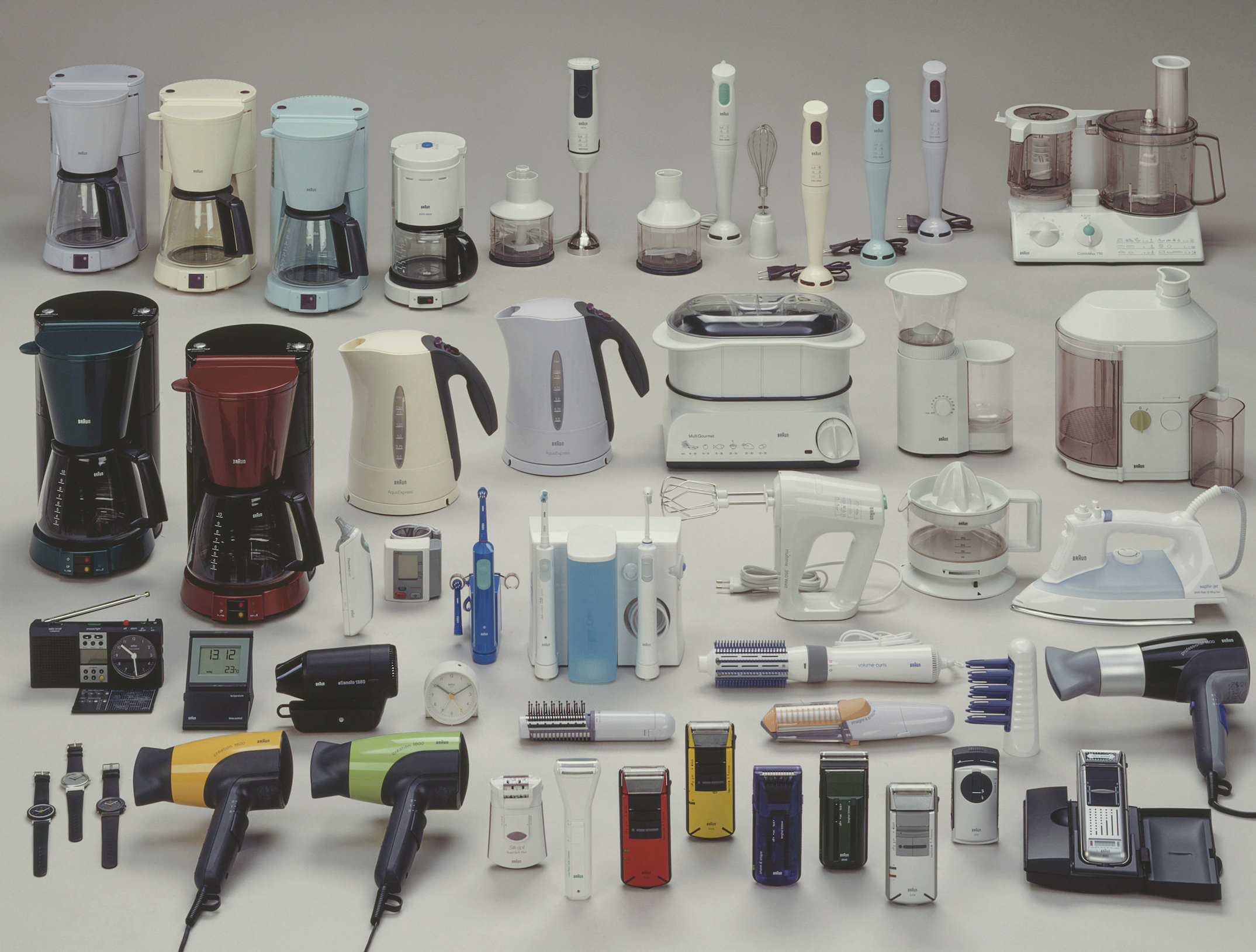
As I speak with Grabes, it becomes clear that he has intimate knowledge of the company’s history and is able to intuit guiding principles from the facts of past events. Take, for example, Braun’s line of orange appliances, released in the 1970s despite the influence of Dieter Rams, the company’s famed former head of design from 1961 to 1995, who typically only worked in black, white, and silver. You can still find them today: a coffee maker, a coffee grinder, a hair dryer, all hued in bright vermillion.
The spirit behind that decision informs Braun’s approach today: making items that people actually want to use, now and in the future. Consider, too, the buildout in the 1950s of distribution and customer service centers throughout Europe, making Braun products easy to acquire and, crucially, service and repair, ensuring that they could be purchased once and used for a long time without needing to be replaced.
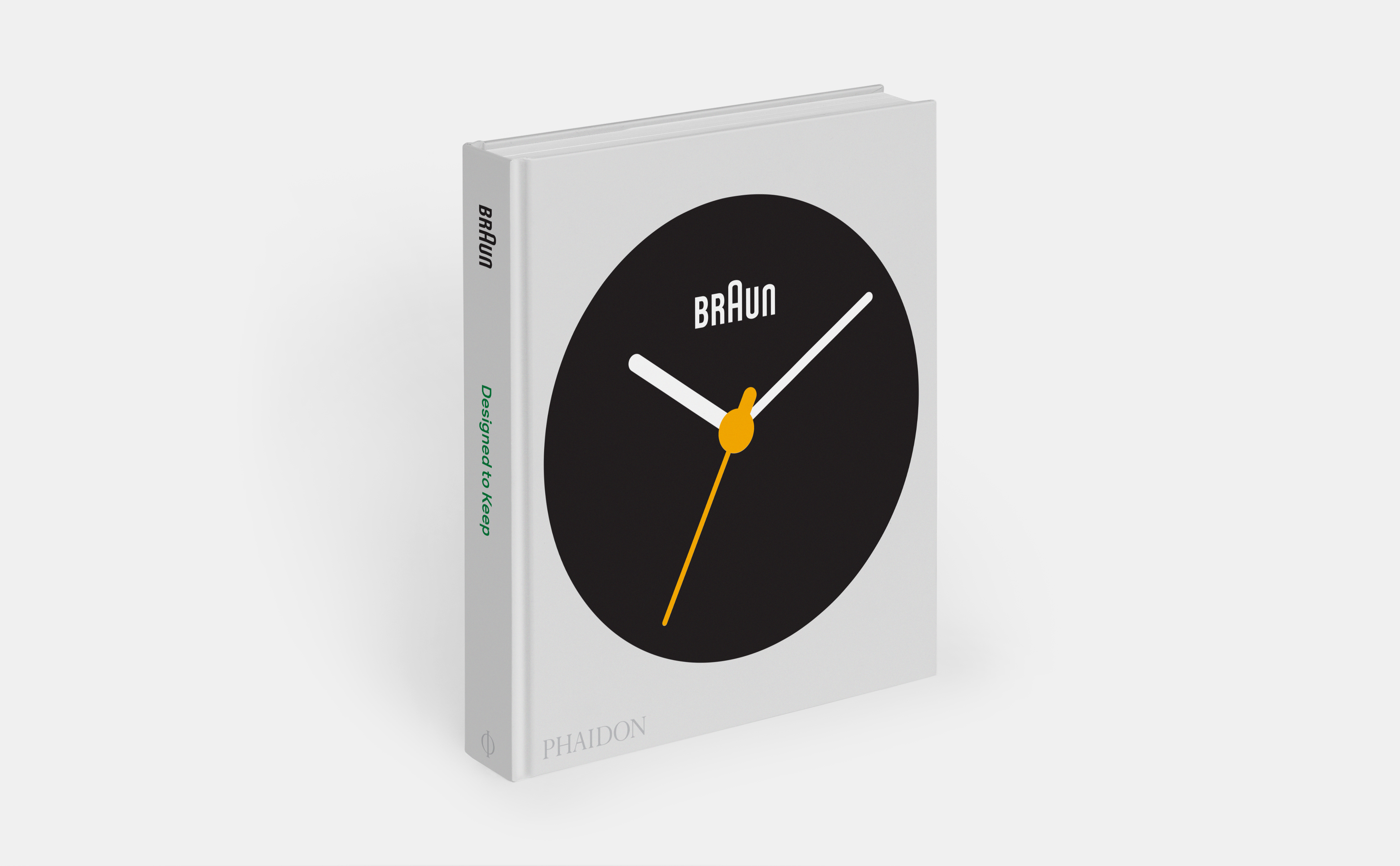
This longevity—not only of the Braun brand, but also of the things it makes—is captured in the upcoming book Braun: Designed to Keep (Phaidon). Tracing the German company’s 102-year history, the volume demonstrates the enduring quality of its products, which result from their design as well as of the way that the company is organized, with teams that prioritize functionality, consistency, and longevity over trends and salability. These values, Grabes tells me, make Braun different from companies that might choose to put out new items every year just to stay in the fast-paced news cycle. They also result in, say, a Braun alarm clock that’s instantly recognizable, and the button on its side easy to find, understand, and use. The point, after all, is not just to have a beautiful object, but to wake up on time.
What was the first thing you designed for Braun?
A shaver. I was working in London, at an agency. The Braun design team was designing the shaver internally, but the management felt like they didn’t understand what young people wanted. (I don’t want to claim I completely got it either; I was 36, 37 at the time, and the product was more for 17-year-olds.) I remember we went to Tokyo to do research, and we went to a home where the father said, “Let’s go in here, and I’ll show you how I shave my son. When he turns 18, he can shave himself.” It was the father’s Braun shaver, and the father didn’t want to give it away. So we understood how important well-designed objects were to people. We ended up designing the Braun Cruzer, which was very successful. Today I see it a little differently—it was still the old design language.Can you say more about that? It seems like the Braun designs adhere to a set of values, but how are they different from, for example, Dieter Rams’s principles?
Dieter defined very fundamental principles that can apply to any design, any company, anywhere in the world. That’s the purpose of them. They’re a lighthouse, and they’re very important to us as something that guides us.
When we created “Past Forward,” in 2009, everyone wanted to reconnect with what had been so special about Braun’s products from the fifties and sixties. We all felt we were far away from that. We didn’t want to do retro design; Braun was always looking forward. I say “we” because it was a group effort; there were people I’d brought with me from the University of Wuppertal, where I was teaching. We wanted to go back to the past and bring it forward again. The best word is translating. We wanted to translate the classic Braun design in order to bring the modern world.
The Braun heritage is what people get excited about. There are collectors; there are museums. We thought, What? We’re not continuing this? Everyone seems to appreciate it and value it, and we don’t? That was the point, to take it from the outside in. We did interviews with people I knew and that others knew, and we convinced the leadership we needed to do something. The design language that we developed came out of that process.
We developed principles about how we wanted to continue with the Braun language. It was a team of between ten and fifteen designers—industrial designers, graphic designers. Everyone had different ideas, and at the time it wasn’t clear what Braun design was, so we looked at the details. For example, buttons: We design appliances, so you always have to have buttons. Buttons are how you engage with the product. In the late nineties and 2000s, Braun products had many different types of buttons. And we said, “No. It can be either a circle or a racetrack.” People now might know [that streamlined approach] from Apple, but Braun was doing it in the fifties and sixties. So, we designed these principles to connect us with the past, but are open enough to bring us forward.
And these principles are still in use?
Yes, they have not changed. They’re very fundamental; they’re literally how you design a Braun product. But, at the same time, they are very open to allow your creativity to design any new item. If you are more prescriptive, you limit the ability of someone to make the most functional design they can make. But if you don’t have principles, then designing a product is arbitrary. We thought it was important to find a balance. They’ve passed the test of time: Thirteen years later, we still use them. It’s not an easy thing to do.How do you think they’ve impacted Braun as a business, and the wider design industry?
What Dieter Rams was doing in the fifties and sixties eventually became general product design. Most notably, Apple took those values on. They made design much simpler in computers and technology, an area where it was so important. As they did that, they created modern product design. Everyone started doing it in their own categories—but, interestingly, Braun didn’t. It went away from those original values while others brought them home. Logitech, Microsoft, Hewlett Packard—they made people aware that this was modern design. These companies, especially Apple, really helped us to reconnect. By going back to our values, we had a chance to succeed again.
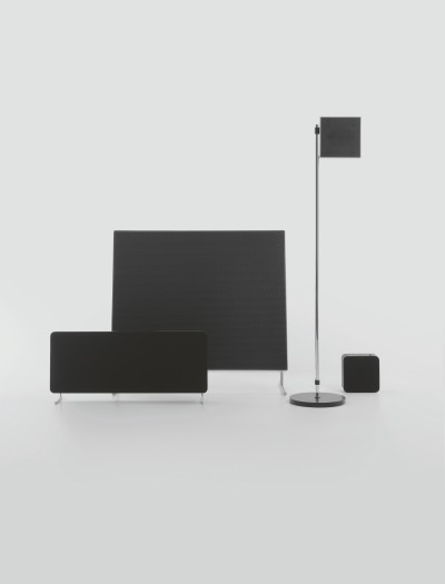
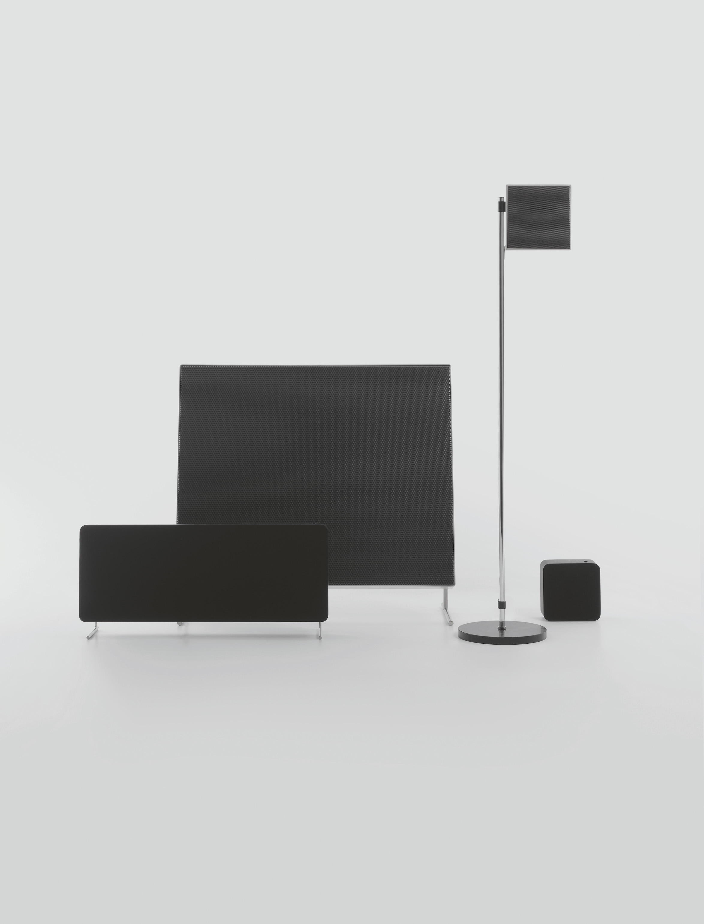
When we created the LE speaker series in 2019, for example, there were long discussions: Do we do something different, because others took on our values? Or are we staying the course? We thought, We can’t pretend to be somebody else—so let’s go into the details. That’s how we got to the aluminum frame, which no one else had done, and the fabric front that sits perfectly in the corner. We also added a button that turns the voice control on and off; we thought we’d give people a choice since that’s not everybody’s cup of tea.I wanted to ask about that: How do you think about the way somebody uses a product? And how does that affect the design?
We went out of the audio category in 1991, with the last edition of the Atelier audio system, so by the time we designed the LE series, a lot of years had passed. We had to decide how we wanted to come back.
We had great new technology that makes it so that the whole room is filled with sound. No matter where you stand or sit, it sounds rich and full and great. We wanted to keep something of the original LE1, so we kept the feet, but you can take them off. We also made it so that the sizing fits the Vitsoe shelves, so that there is some reference to the Braun and Dieter Rams visual context.
We also wanted to translate the design heritage via the buttons. Here, the on/off button for the voice control is like the Braun calculator buttons. It lights up when you mute, so you know when it’s not on. The other buttons are electrostatic—you don’t have to push too much. We felt that was a nice way to bring what used to be mechanical buttons into today’s world. It’s not totally flat, you still get feedback and interaction, but in a nice electronic way.
We also thought about the visuals. There’s no depth to the speaker grille. Normally you have a frame in the front or a gap on the side, and we said, “We’re not going to do this. We’re going to have the edge be the parting line.” It’s just a small detail, but it’s very important for us. It creates these details that are different from whatever else is on the market.
It seems like materials, finishes, and colors is the area where trends weigh on the most. How do you approach that?
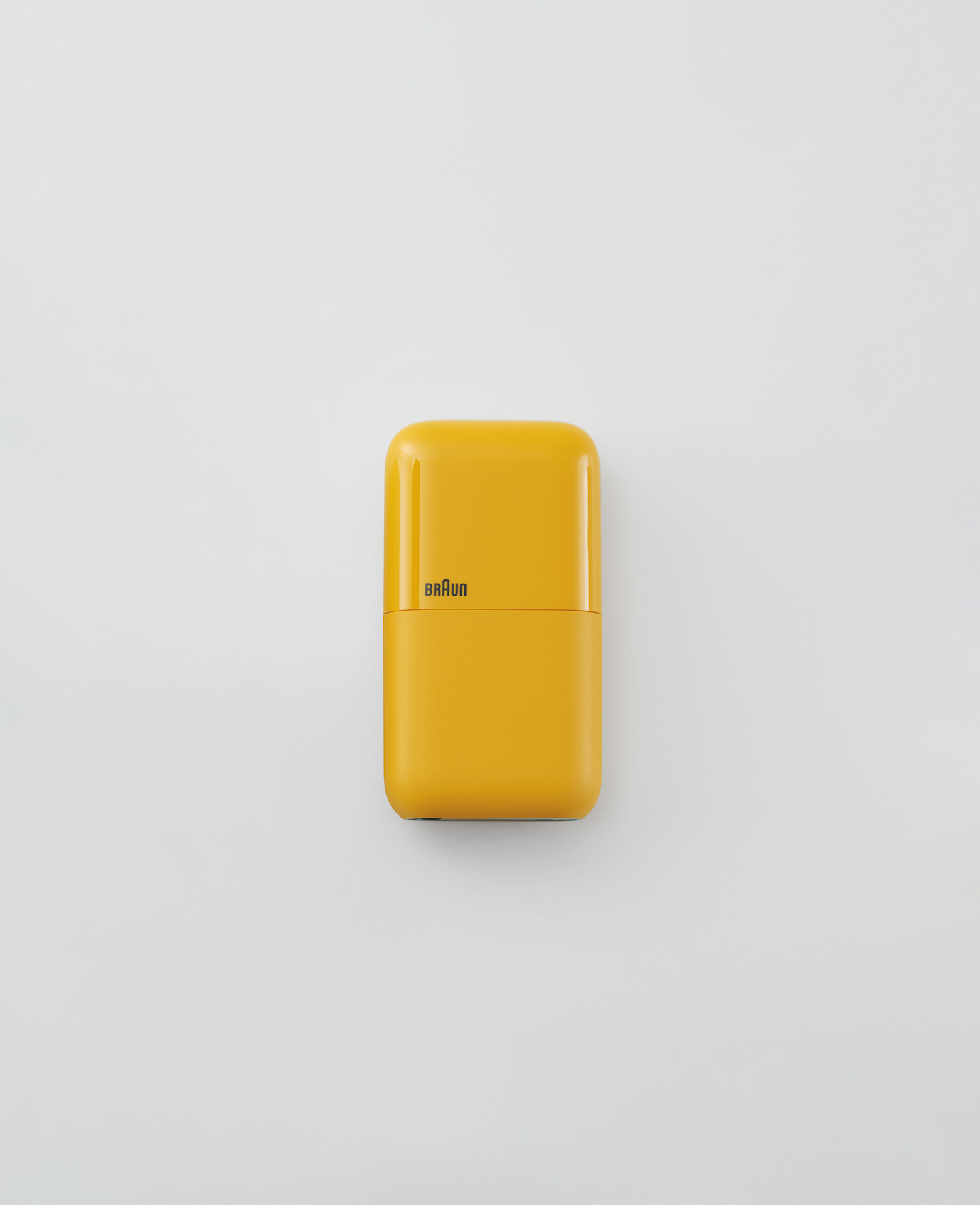
This question comes up every day for us. For example, in 2020, we created a pocket shaver, something you can take with you when you travel. Most of the shavers that are sold are black, or maybe blue or silver. So, you have to offer that, but you don’t have to stop there. With the pocket shaver, we decided to offer a yellow one as a special edition for the Olympics in China. Because there’s so little to the form, when there’s color it’s a statement, as opposed to when you have a very complex form that becomes too much when there’s color involved.
It’s a challenge when you don’t create a new product every year. We think it’s worth it to make a new product when the technology actually advances, maybe every four, five, even ten years.
There’s always economic pressure to create something new. So with this product, we offered black first, then white, then yellow. It’s different from what other companies do, but it’s how we manage creating new things over time.How was this yellow chosen?
We tapped into the past! For the Olympic games in 1972 in Munich, Braun made a special-edition shaver in this kind of orangey yellow. So, we thought that since we were doing a shaver for the Olympics today, why not reconnect with that? It was a very popular color at the time, and it was cool and different.
You’ve clearly got a top-notch design team. How did you put it together?
It’s unique, but also not unique at all. You need to have consistency, and it’s important to understand the brand well. And that’s only possible when you have consistency in the people.
There’s a story I want to share: When I joined from the university, we were asking, “How do we want to do this? It’s not possible for us to design individually.” We were looking at the Braun collection, which had been collected by Horst Kaupp, who went to all trade shows, and we asked him, “Why does it always say who the designer is on the products?” We knew that these things were not made by just one designer, that they were made by a team. We discussed it, and we thought, We will not do this. We will always say “Braun Design” as the creator, as a team, so everybody can own it. If it’s not good, it’s everybody’s responsibility. This little detail of ownership helps to make it a team effort.
Usually people work in pairs, and then we review things as a team. Sometimes we all jump on something as a team. By avoiding not crediting anyone individually, we let everyone build on somebody else’s great idea. That’s where the best work comes from. The team has been together for ten, fifteen years.
Ultimately, what really works is if you stay true to your values and create trust, meaning you don’t change the way you see the world every year. At a time when sustainability is so important, the way we contribute is by making our products visually and functionally long-lasting, so that people will want to have them around. Braun makes products that you use every day, so every one of them should last; they should be your companion for many years to come.