ISSUE↓
STORY TYPE↓
AUTHOR↓
14
THE BUILT ENVIRONMENT
April 28, 2025
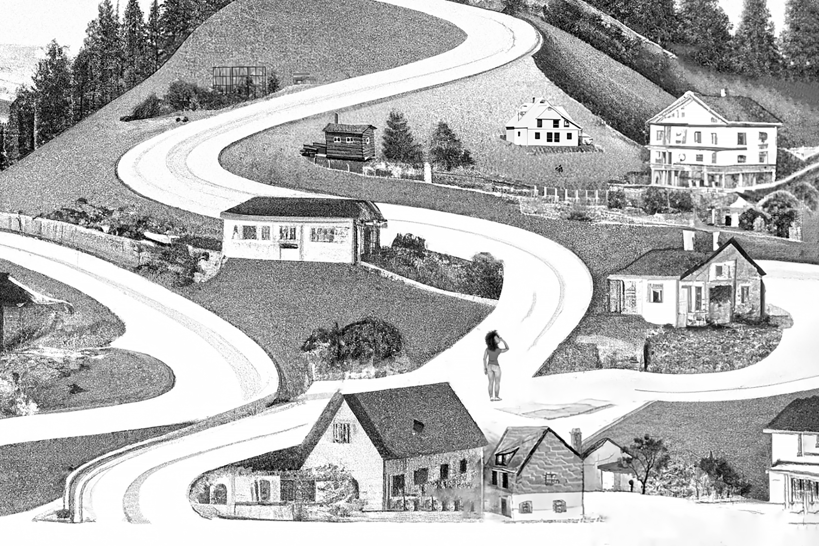
Neuroaesthetics Has Been Around for 25 Years. Are Architects Paying Attention Yet?
by Diana Budds
14
THE BUILT ENVIRONMENT
April 14, 2025
How Food Forests Could Reshape Our Cities
by LinYee Yuan

14
OBJECTS AND THINGS
April 21, 2025
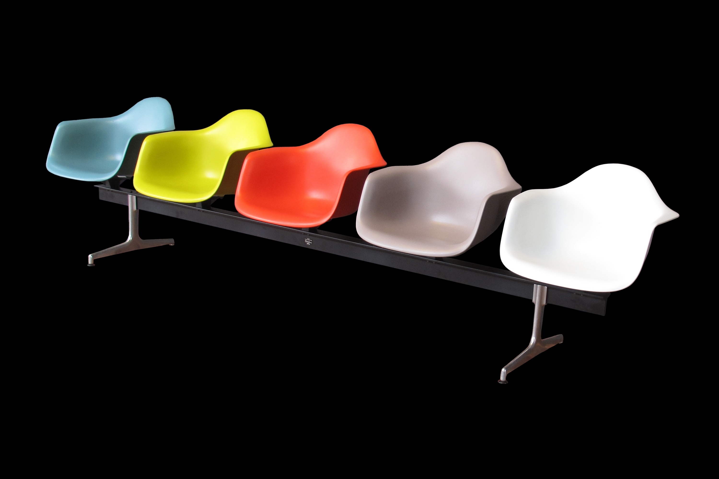
Furniture That Supports Us, When and Where We Need It
by Anjulie Rao
14
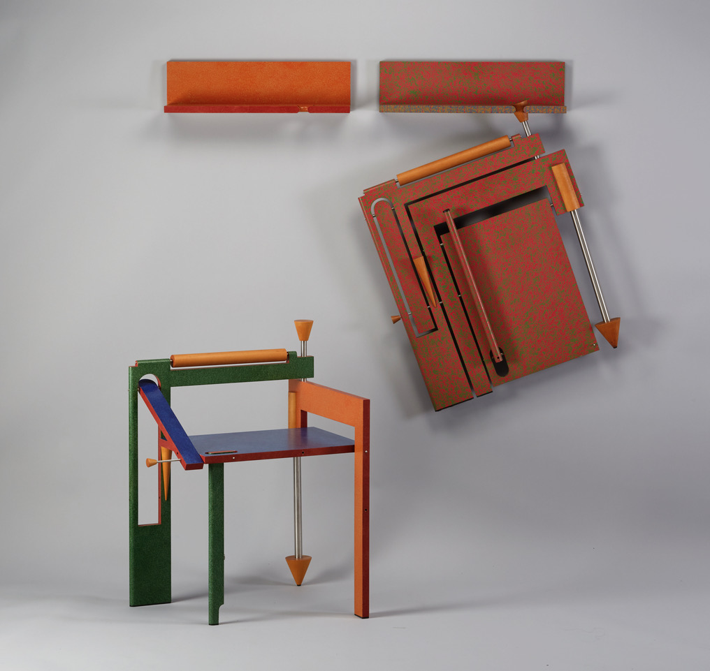
OBJECTS AND THINGS
April 7, 2025
Peter Shire and Ryan Preciado Talk Cups, Memphis, and Making Things That Last
by Jonathan Griffin
14
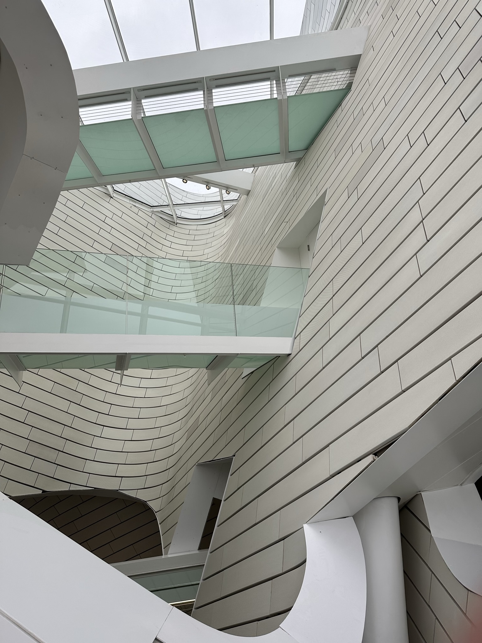
THE BUILT ENVIRONMENT
March 24, 2025
What Terra-Cotta Can Teach Us About Beauty
by Kriston Capps
14
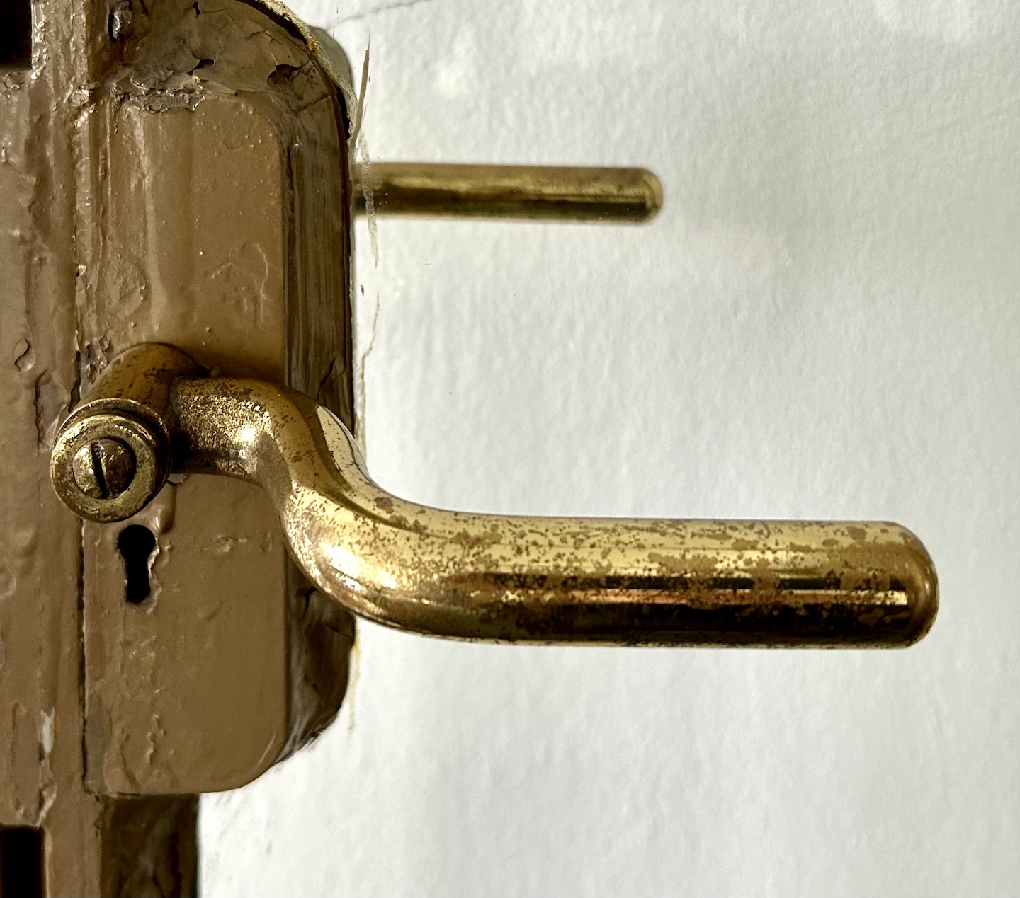
THE BUILT ENVIRONMENT
March 10, 2025
Handling Hardware: Modernism and the Door
by Edwin Heathcote
14
PERSPECTIVE
February 24, 2025
Why Are Most Real Estate Listings a Vibe Killer?
by FOR SCALE
14
PERSPECTIVE
February 17, 2025
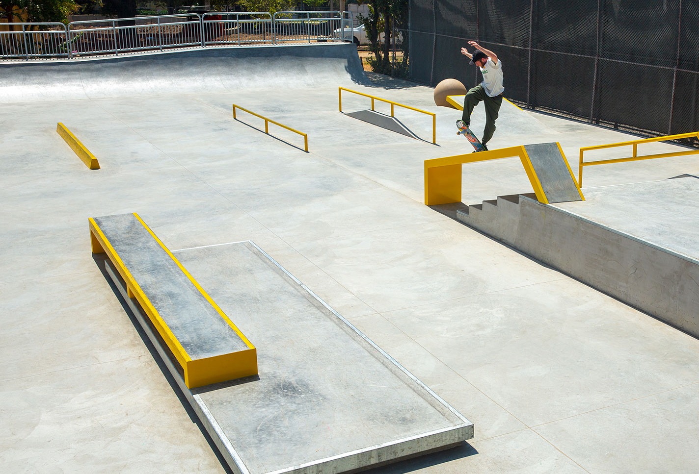
Hey, City Planners: Pay Attention to Skateboarders
by Zach Moldof
14
THE BUILT ENVIRONMENT
February 10, 2025
The Overlooked Intelligence of Architectural B-Sides
by Charlie Weak
14
BOOK REVIEW
February 3, 2025
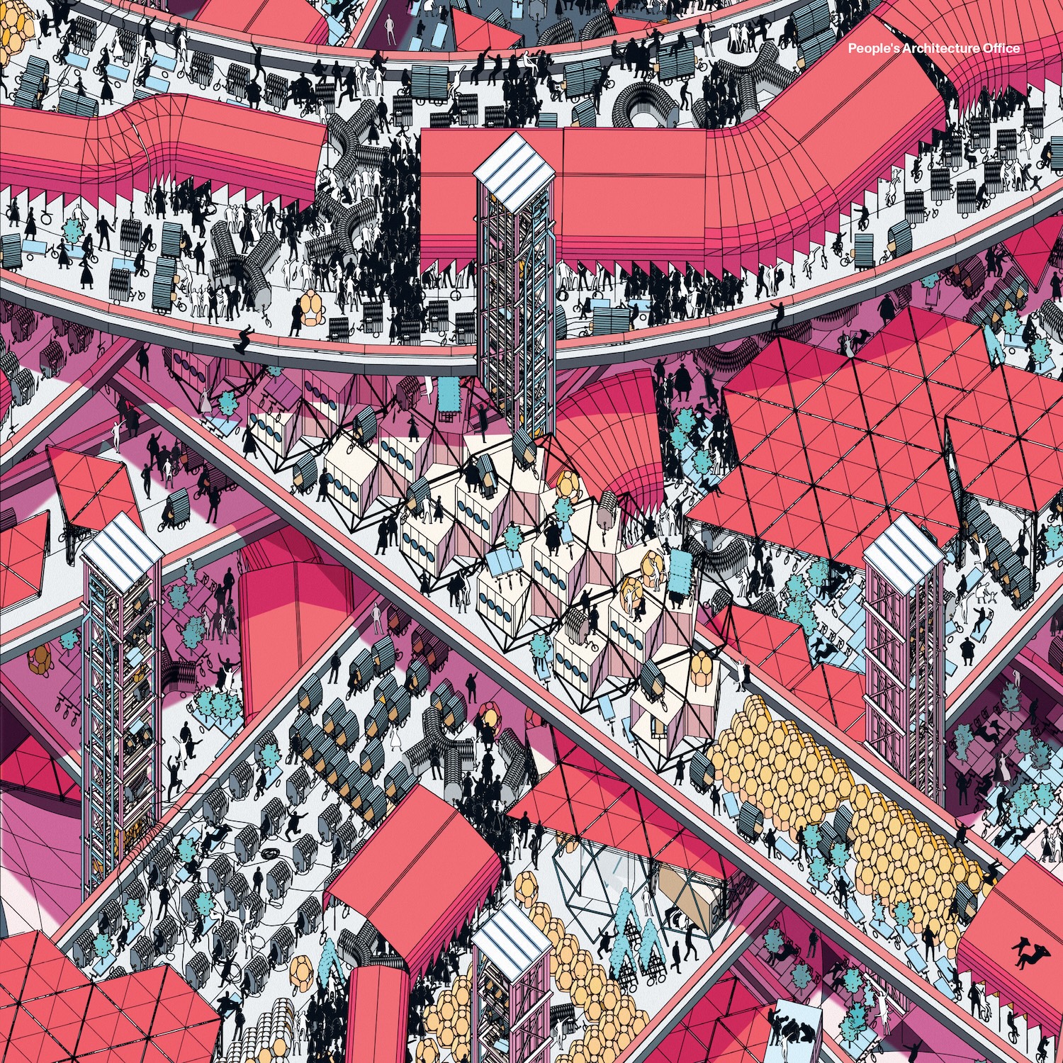
After a 50-Year Pause, Archigram Keeps the Dream Alive
by Anthony Paletta
14
PEOPLE
January 21, 2025
In Praise of the Pedestrian
by Phillip Cox

13
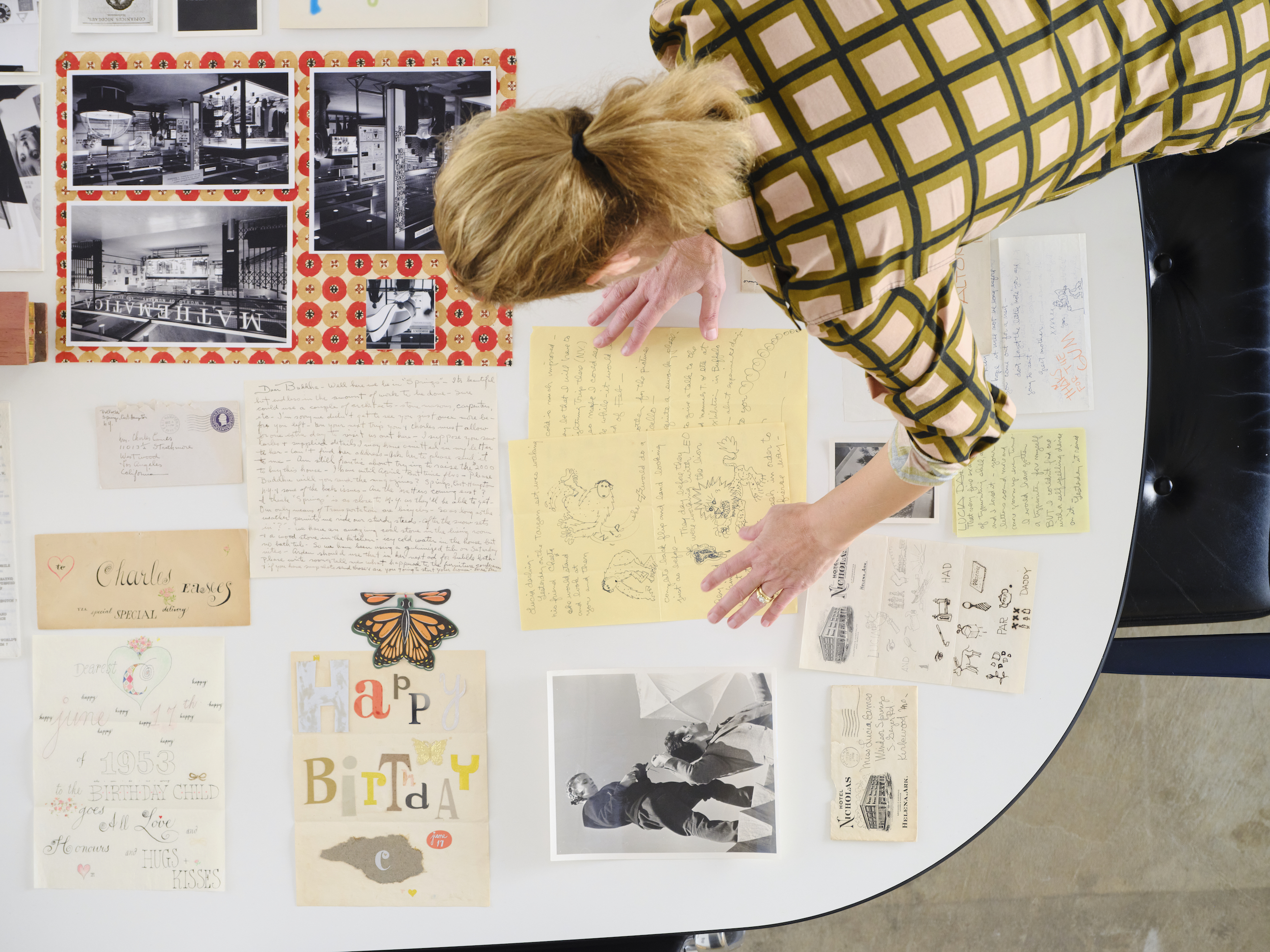
PERSPECTIVE
December 16, 2024
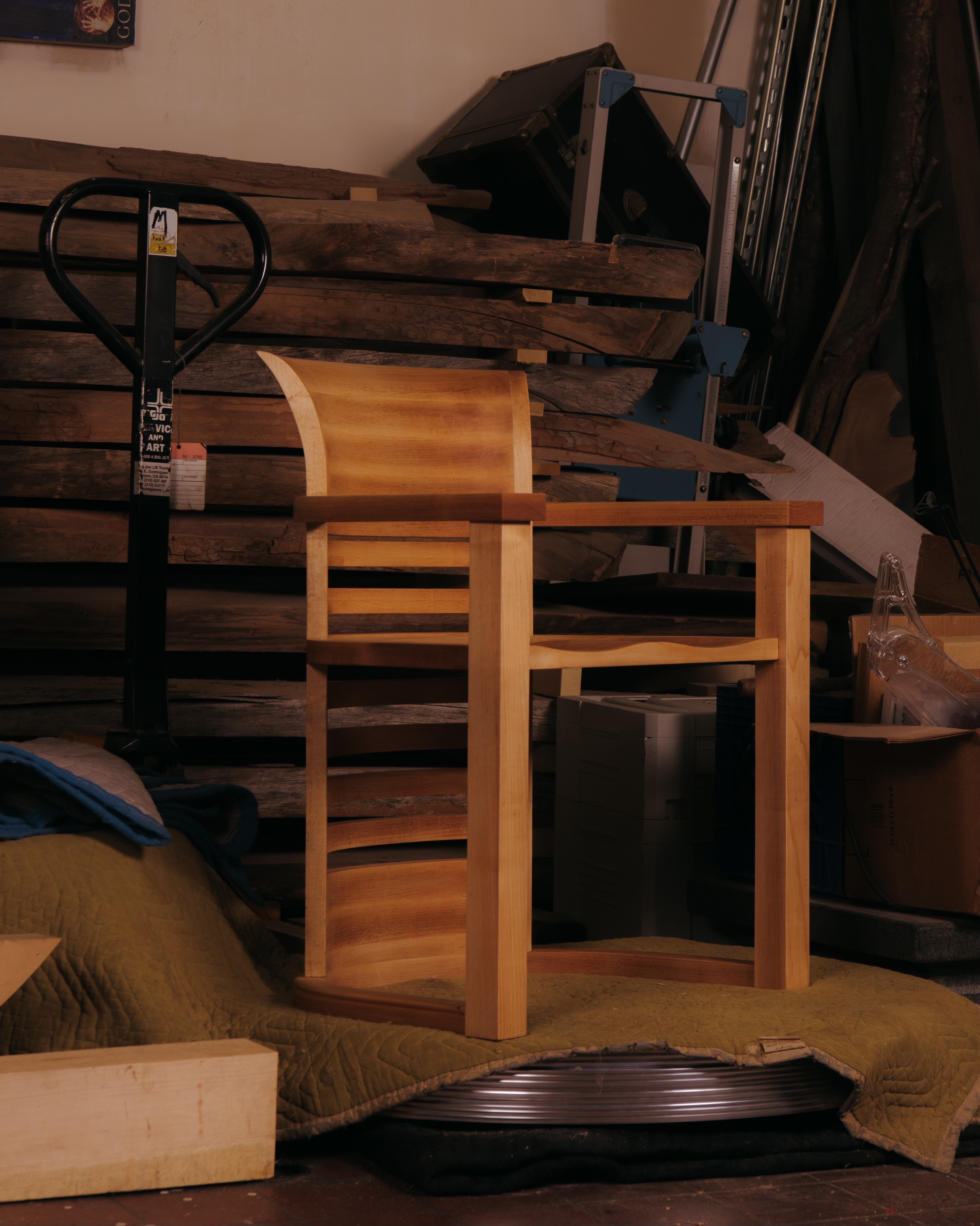
Some Chests of Drawers I Have Known
by Roy McMakin

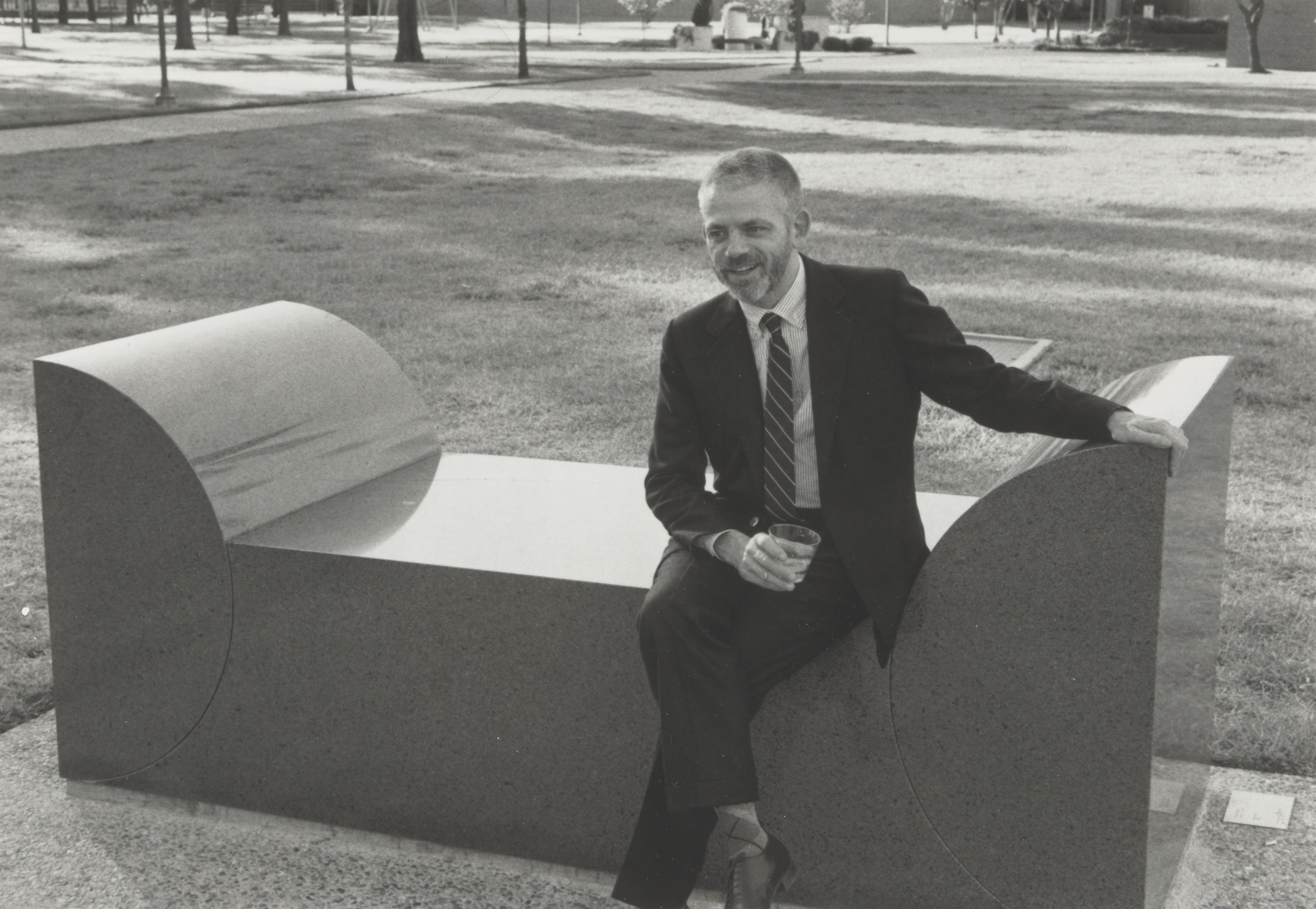
13
THE BUILT ENVIRONMENT
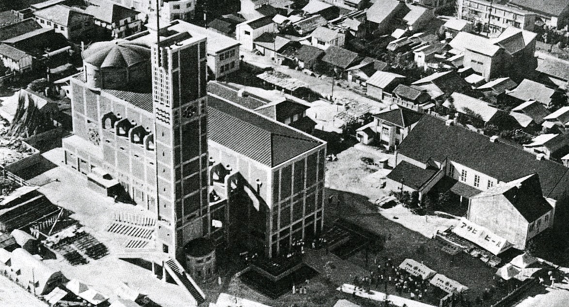
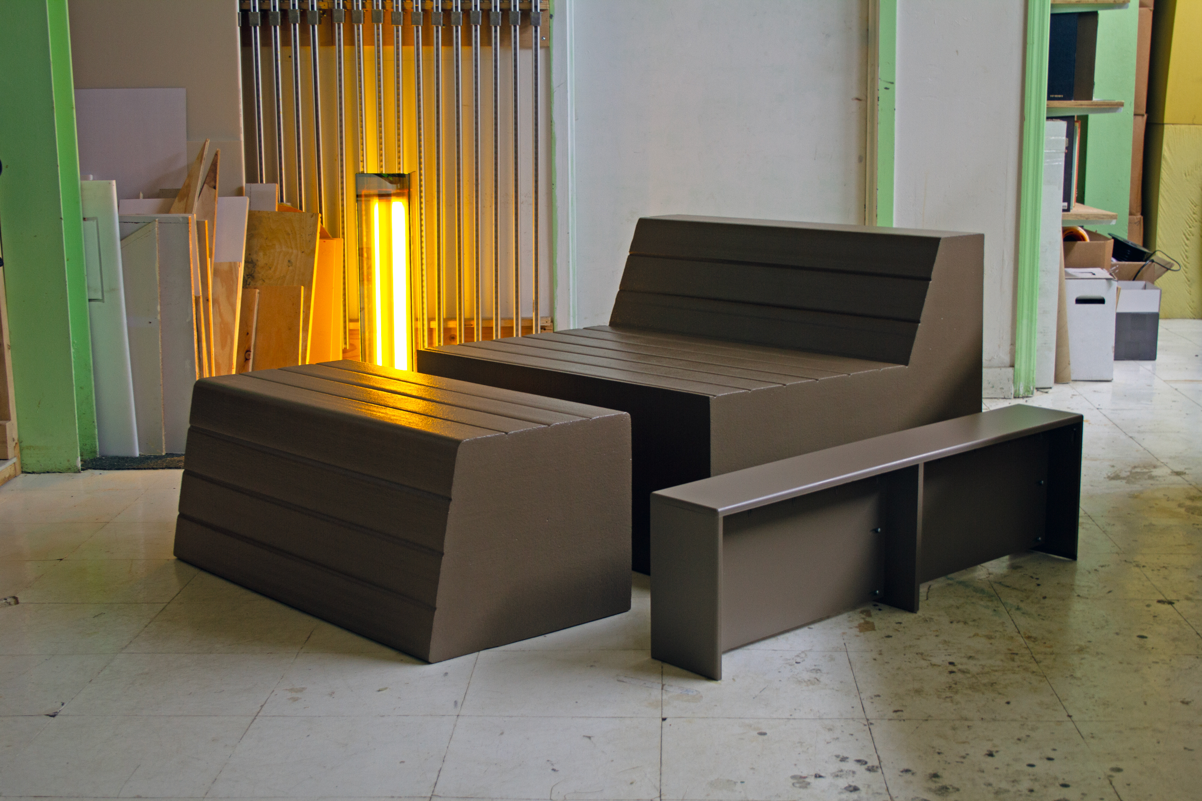
December 9, 2024
Why Are Scott Burton’s Benches Disappearing?
by Mark Byrnes
13
BOOK REVIEW
November 25, 2024
A Mind-Body Experience of Architecture, Delivered in a Photo
by Marianela D’Aprile
13
PERSPECTIVE
November 18, 2024
Seeing Chinatown as a Readymade
by Philip Poon

13
PEOPLE
November 11, 2024
The Place of the Handmade Artifact in a Tech-Obsessed Era
by Anne Quito
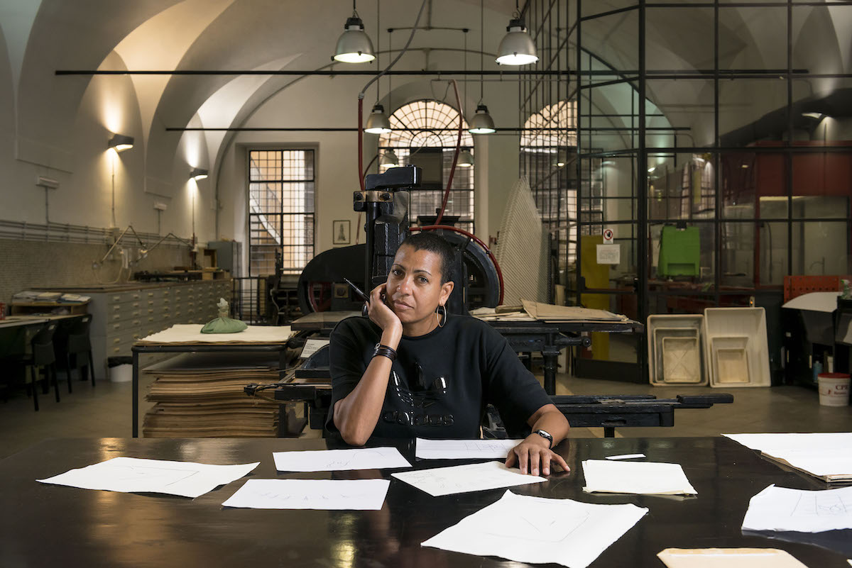
13
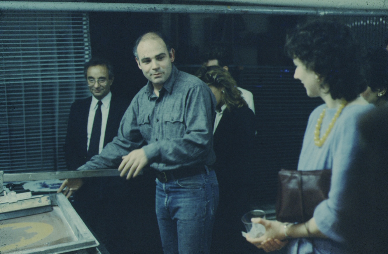
THE BUILT ENVIRONMENT
November 4, 2024
How a Storied Printmaker Advances the Practice of Architecture
by Diana Budds
12
PEOPLE
October 21, 2024
Sounding Out a Better Way to Build
by Jesse Dorris

12
THE BUILT ENVIRONMENT
October 7, 2024
What It Means—and What It’s Worth—to Be “Light”
by Julie Lasky

12
PERSPECTIVE
September 23, 2024
Redefining “Iconic” Architecture and Ideals
by Sophie Lovell
12
PERSPECTIVE
September 9, 2024
Surrendering to What Is
by Marianne Krogh
11
THE BUILT ENVIRONMENT
August 26, 2024
Sometimes, Democratic Design Doesn’t “Look” Like Anything
by Zach Mortice

11
THE BUILT ENVIRONMENT
August 19, 2024
What Does Your Home Say About You?
by Shane Reiner-Roth

11
BOOK REVIEW
August 12, 2024
Is Building Better Cities a Dream Within Reach?
by Michael Webb

11
PEOPLE
August 5, 2024
The Value of Unbuilt Buildings
by George Kafka

11
THE BUILT ENVIRONMENT
July 29, 2024
Future-Proofing a Home Where Water Is a Focus and a Thread
by Alexandra Lange
11
BOOK REVIEW
July 22, 2024
Modernist Town, U.S.A.
by Ian Volner

11
PEOPLE
July 15, 2024
Buildings That Grow from a Place
by Anthony Paletta
10
URBANISM
June 24, 2024
What We Lose When a Historic Building Is Demolished
by Owen Hatherley

10
PERSPECTIVE
June 17, 2024
We Need More Than Fewer, Better Things
by Deb Chachra
10
THE BUILT ENVIRONMENT
June 3, 2024
An Ode to Garages
by Charlie Weak
10
PERSPECTIVE
May 28, 2024
In Search of Domestic Kintsugi
by Edwin Heathcote

10
THE BUILT ENVIRONMENT
May 13, 2024
The Perils of the Landscapes We Make
by Karrie Jacobs
10
PERSPECTIVE
May 6, 2024
Using Simple Tools as a Radical Act of Independence
by Jarrett Fuller
9
PERSPECTIVE
April 29, 2024
Why Can’t I Just Go Home?
by Eva Hagberg
9
PEOPLE
April 22, 2024
Why Did Our Homes Stop Evolving?
by George Kafka
9
ROUNDTABLE
April 8, 2024
Spaces Where the Body Is a Vital Force
by Tiffany Jow
9
BOOK REVIEW
April 1, 2024
Tracing the Agency of Women as Users and Experts of Architecture
by Mimi Zeiger

9
PERSPECTIVE
March 25, 2024
Are You Sitting in a Non-Place?
by Mzwakhe Ndlovu

9
ROUNDTABLE
March 11, 2024
At Home, Connecting in Place
by Marianela D’Aprile

9
PEOPLE
March 4, 2024
VALIE EXPORT’s Tactical Urbanism
by Alissa Walker
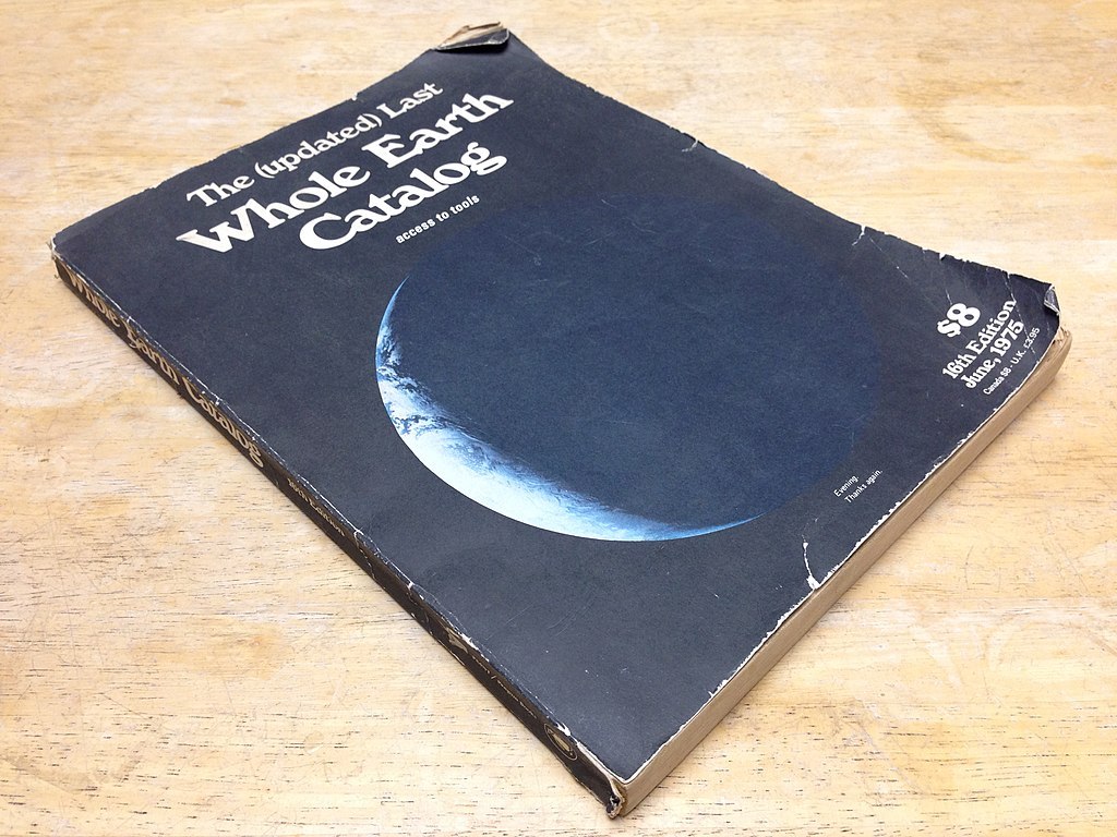
8
PERSPECTIVE
February 26, 2024
What the “Whole Earth Catalog” Taught Me About Building Utopias
by Anjulie Rao
8
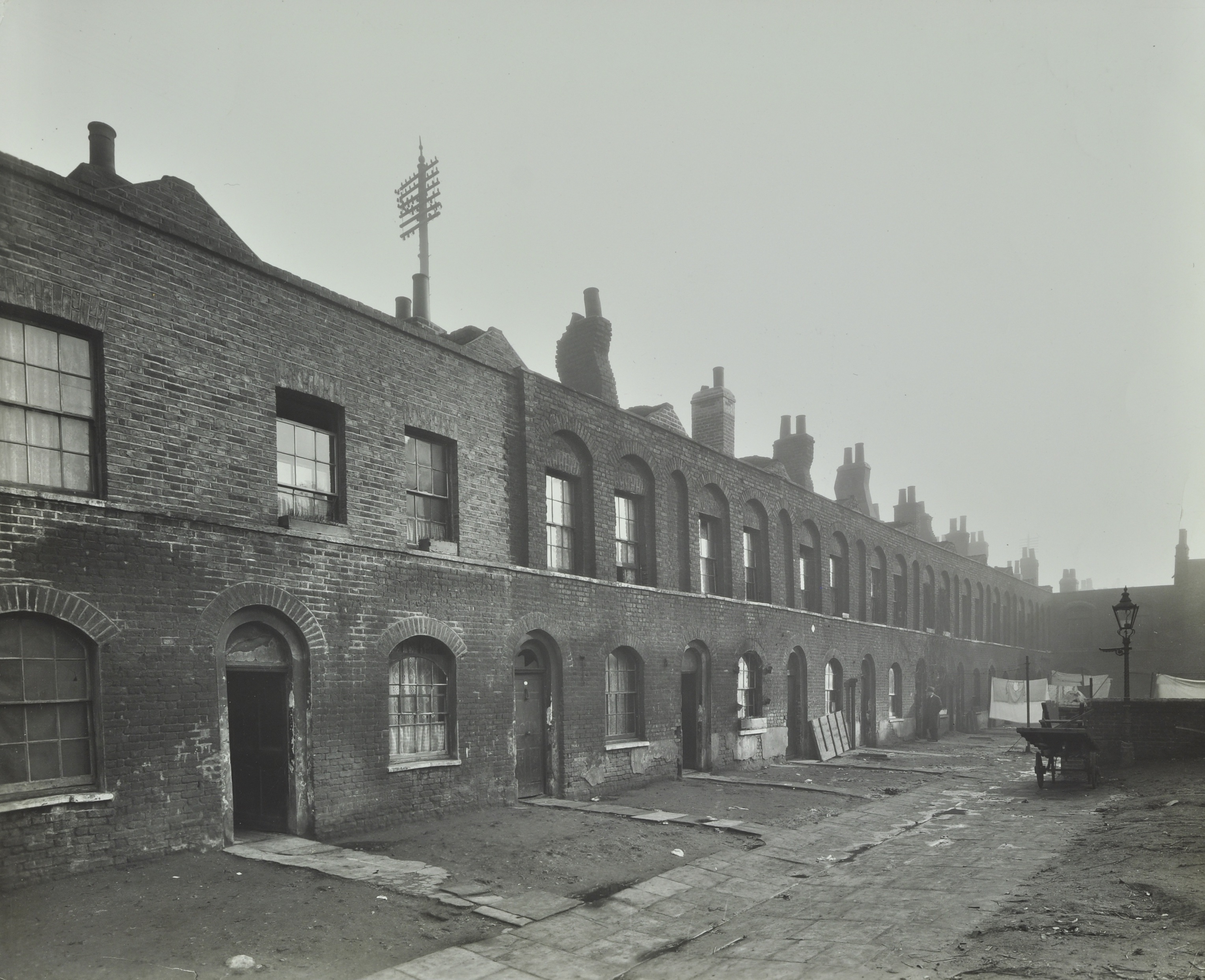
THE BUILT ENVIRONMENT
February 19, 2024
How a Run-Down District in London Became a Model for Neighborhood Revitalization
by Ellen Peirson
8
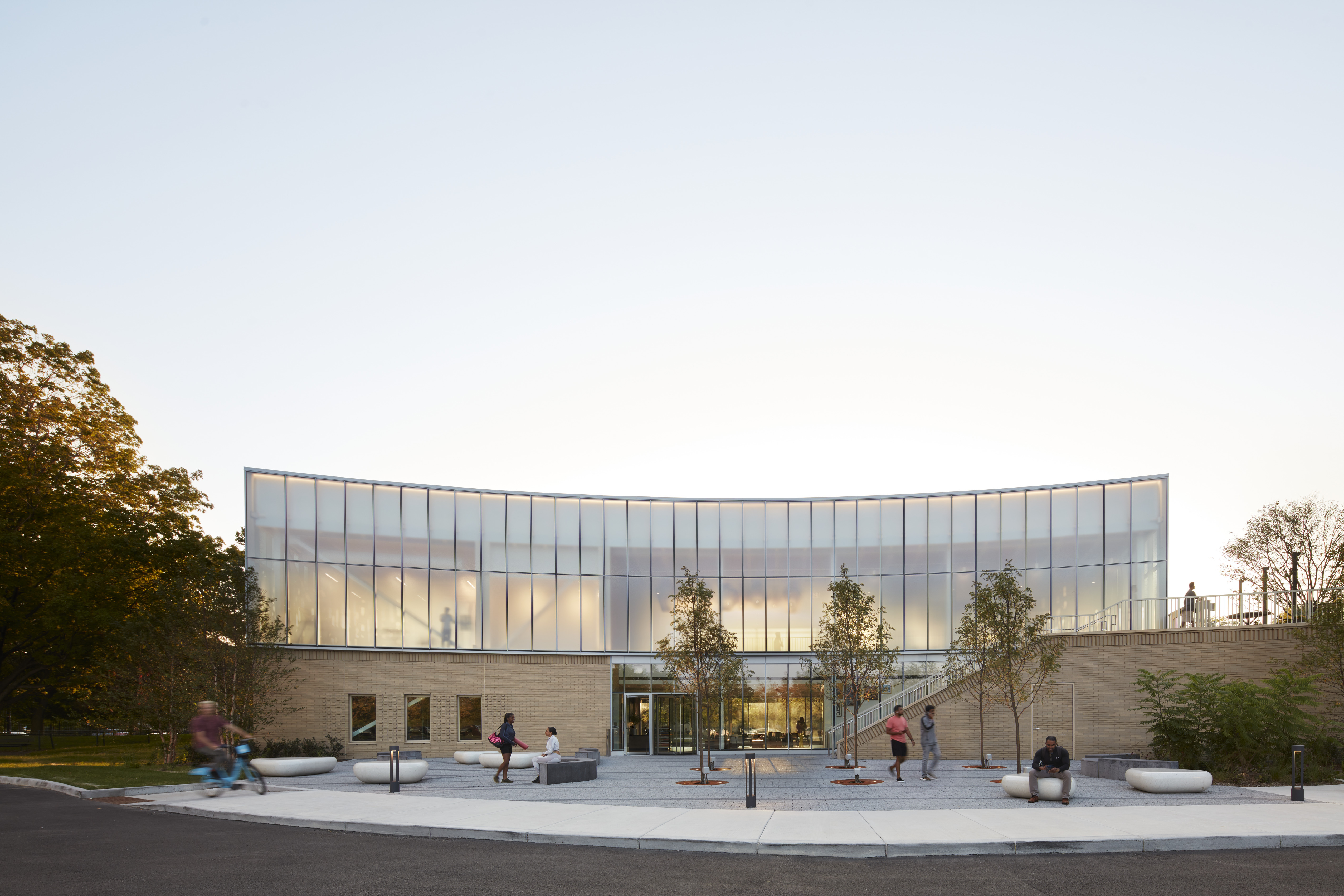
THE BUILT ENVIRONMENT
February 12, 2024
In Brooklyn, Housing That Defies the Status Quo
by Gideon Fink Shapiro

8
PERSPECTIVE
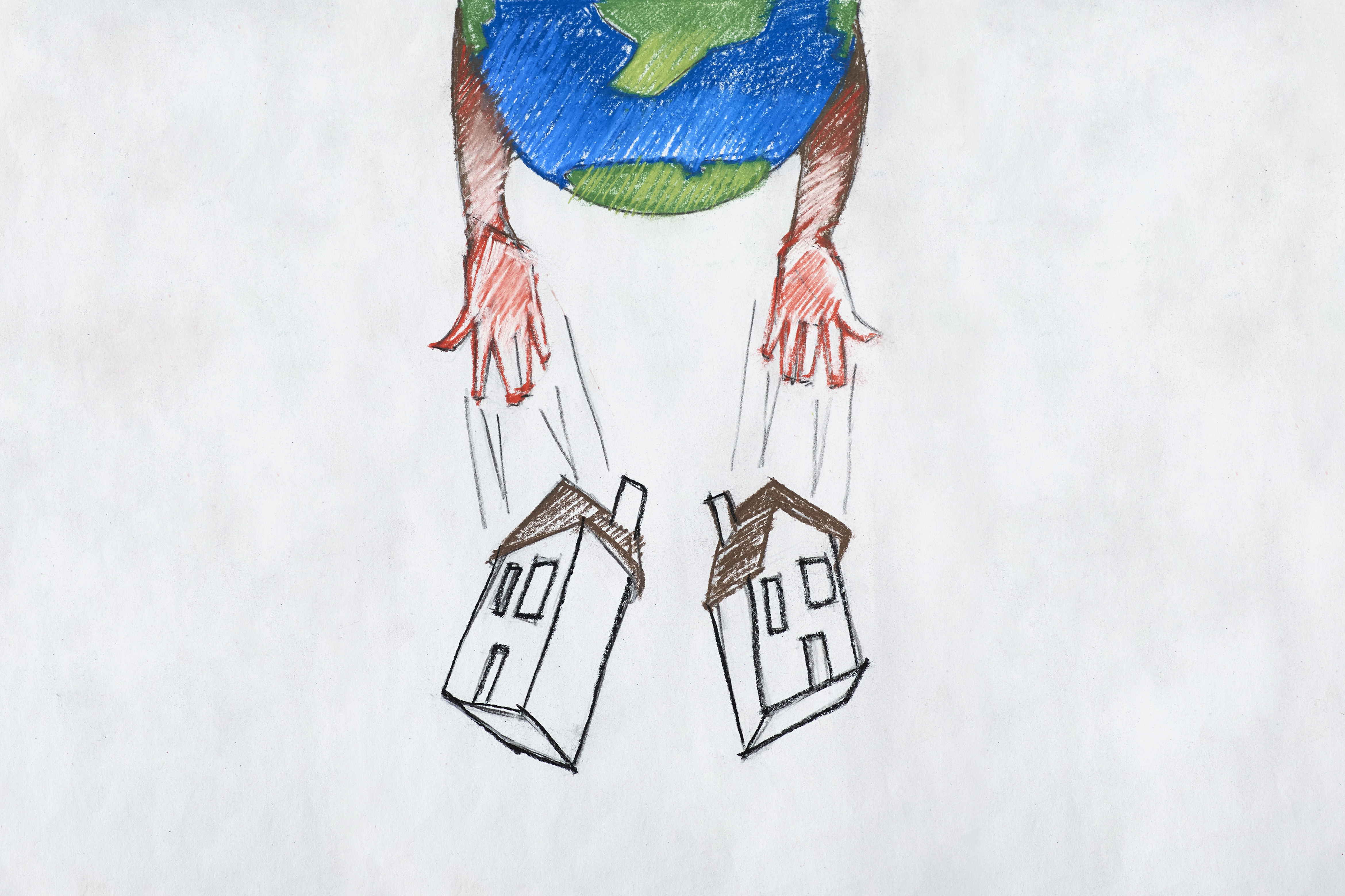
February 5, 2024
That “Net-Zero” Home Is Probably Living a Lie
by Fred A. Bernstein
8
PERSPECTIVE
January 22, 2024
The Virtue of Corporate Architecture Firms
by Kate Wagner
8
PERSPECTIVE
January 16, 2024
How Infrastructure Shapes Us
by Deb Chachra
8
THE BUILT ENVIRONMENT
January 8, 2024
The Defiance of Desire Lines
by Jim Stephenson

7
PEOPLE
December 18, 2023
This House Is Related to You and to Your Nonhuman Relatives
by Sebastián López Cardozo
7
THE BUILT ENVIRONMENT
December 11, 2023
What’s the Point of the Plus Pool?
by Ian Volner
7
BOOK REVIEW
December 4, 2023
The Extraordinary Link Between Aerobics and Architecture
by Jarrett Fuller
7
THE BUILT ENVIRONMENT
November 27, 2023
Architecture That Promotes Healing and Fortifies Us for Action
by Kathryn O’Rourke
7
PEOPLE
November 6, 2023
How to Design for Experience
by Diana Budds

7
PEOPLE
October 30, 2023
The Meaty Objects at Marta
by Jonathan Griffin
6
OBJECTS
October 23, 2023
How Oliver Grabes Led Braun Back to Its Roots
by Marianela D’Aprile

6
URBANISM
October 16, 2023
Can Adaptive Reuse Fuel Equitable Revitalization?
by Clayton Page Aldern
6
PERSPECTIVE
October 9, 2023
What’s the Point of a Tiny Home?
by Mimi Zeiger

6
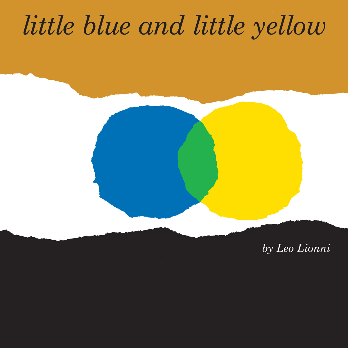
OBJECTS
October 2, 2023
A Book Where Torn-Paper Blobs Convey Big Ideas
by Julie Lasky

6
THE BUILT ENVIRONMENT
September 24, 2023
The Architecture of Doing Nothing
by Edwin Heathcote
6
BOOK REVIEW
September 18, 2023
What the “Liebes Look” Says About Dorothy Liebes
by Debika Ray
6
PEOPLE
September 11, 2023
Roy McMakin’s Overpowering Simplicity
by Eva Hagberg
6
OBJECTS
September 5, 2023
Minimalism’s Specific Objecthood, Interpreted by Designers of Today
by Glenn Adamson

5
ROUNDTABLE
August 28, 2023
How Joan Jonas and Eiko Otake Navigate Transition
by Siobhan Burke
5
OBJECTS
August 21, 2023
The Future-Proofing Work of Design-Brand Archivists
by Adrian Madlener
5
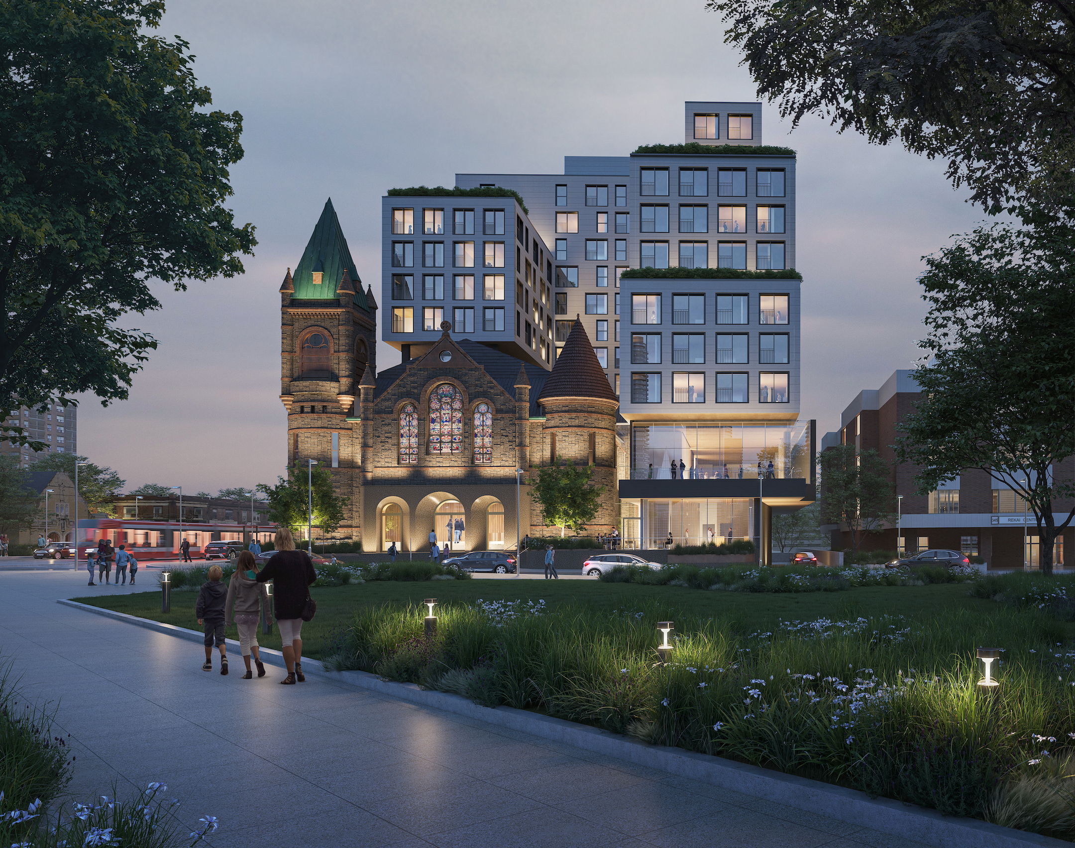
URBANISM
August 14, 2023
Can a Church Solve Canada’s Housing Crisis?
by Alex Bozikovic
5
PEOPLE
August 7, 2023
In Search of Healing, Helen Cammock Confronts the Past
by Jesse Dorris
5
URBANISM
July 31, 2023
What Dead Malls, Office Parks, and Big-Box Stores Can Do for Housing
by Ian Volner

5
PERSPECTIVE
July 24, 2023
A Righteous Way to Solve “Wicked” Problems
by Susan Yelavich
5
OBJECTS
July 17, 2023
Making a Mess, with a Higher Purpose
by Andrew Russeth
5
ROUNDTABLE
July 10, 2023
How to Emerge from a Starchitect’s Shadow
by Cynthia Rosenfeld
4
PEOPLE
June 26, 2023
There Is No One-Size-Fits-All in Architecture
by Marianela D’Aprile
4
PEOPLE
June 19, 2023
How Time Shapes Amin Taha’s Unconventionally Handsome Buildings
by George Kafka
4
PEOPLE
June 12, 2023
Seeing and Being Seen in JEB’s Radical Archive of Lesbian Photography
by Svetlana Kitto

4
PERSPECTIVE
June 5, 2023
In Built Environments, Planting Where It Matters Most
by Karrie Jacobs
3
PERSPECTIVE
May 30, 2023
On the Home Front, a Latine Aesthetic’s Ordinary Exuberance
by Anjulie Rao
3
PERSPECTIVE
May 21, 2023
For a Selfie (and Enlightenment), Make a Pilgrimage to Bridge No. 3
by Alexandra Lange

3
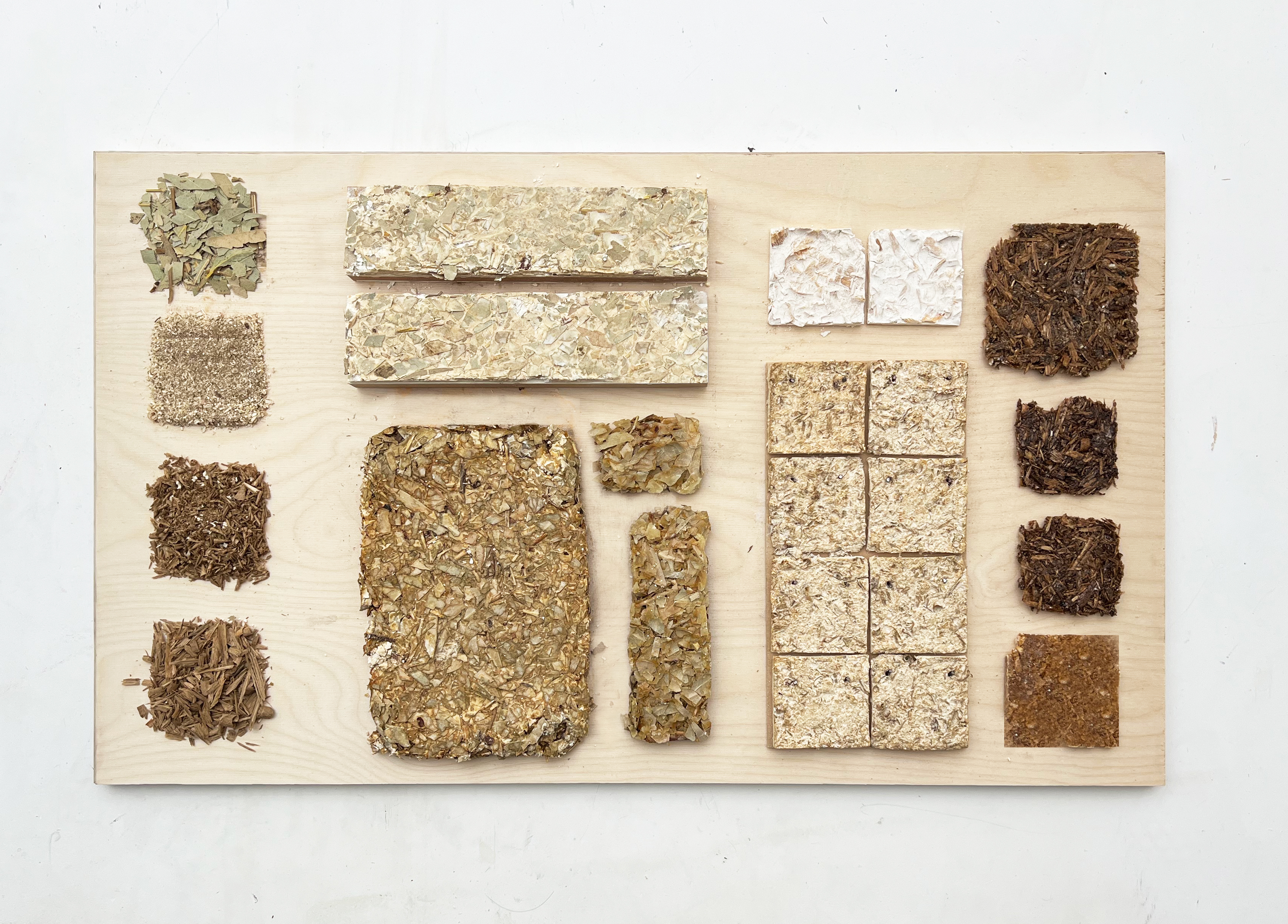
THE BUILT ENVIRONMENT
May 8, 2023
The Building Materials of the Future Might Be Growing in Your Backyard
by Marianna Janowicz
3
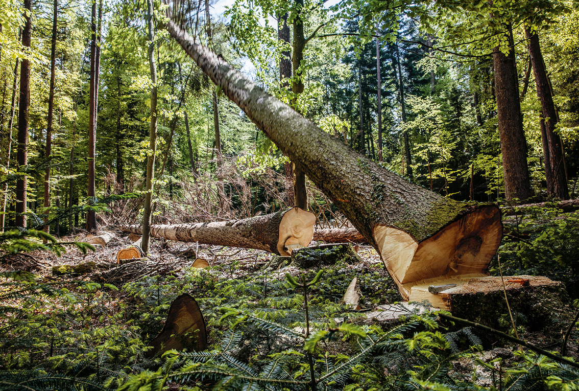
BOOK REVIEW
May 1, 2023
Moving Beyond the “Fetishisation of the Forest”
by Edwin Heathcote
2
ROUNDTABLE
April 24, 2023
Is Craft Still Synonymous with the Hand?
by Tiffany Jow
2
PEOPLE
April 17, 2023
A Historian Debunks Myths About Lacemaking, On LaceTok and IRL
by Julie Lasky

2
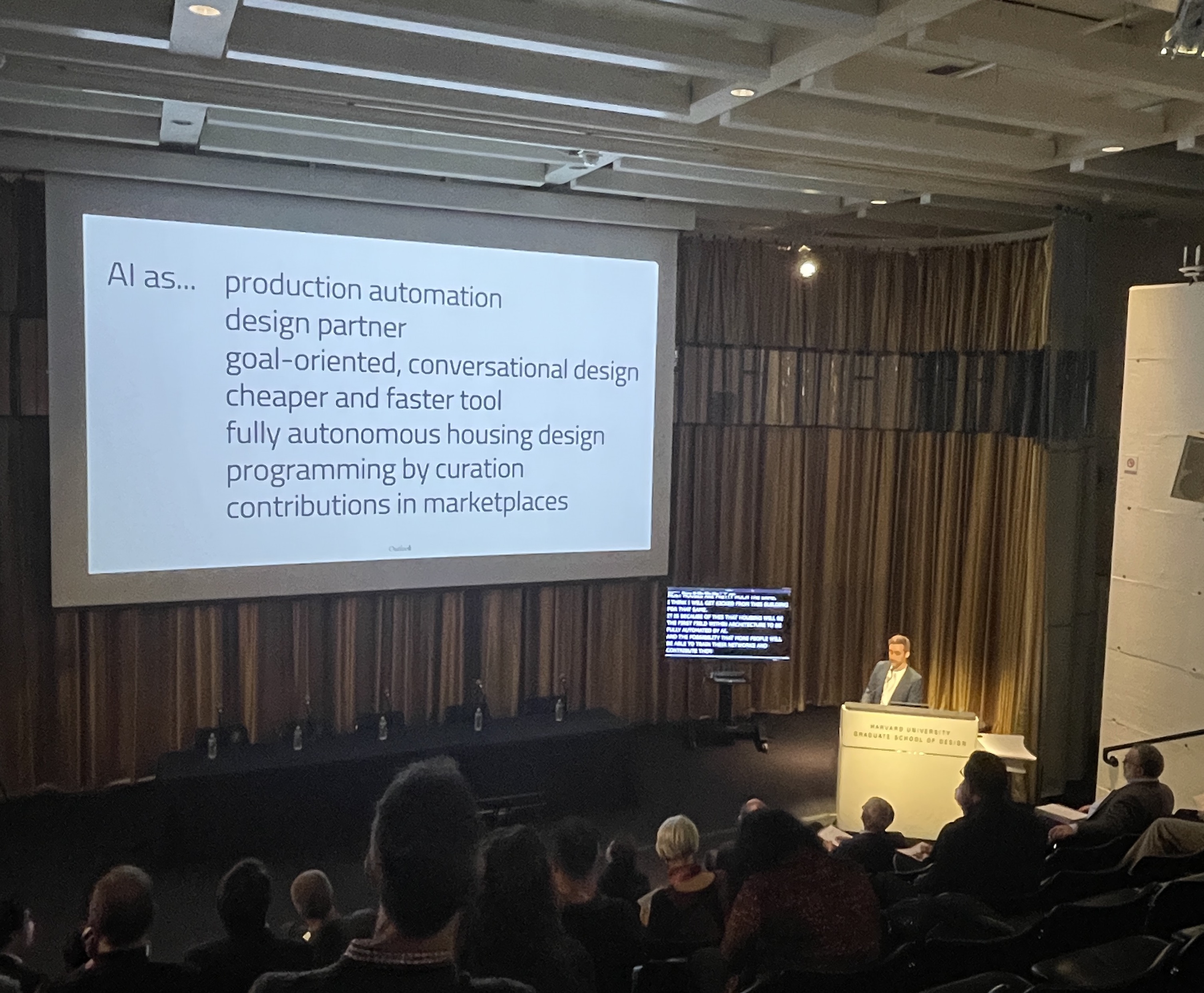
THE BUILT ENVIRONMENT
April 10, 2023
How AI Helps Architects Design, and Refine, Their Buildings
by Ian Volner
2
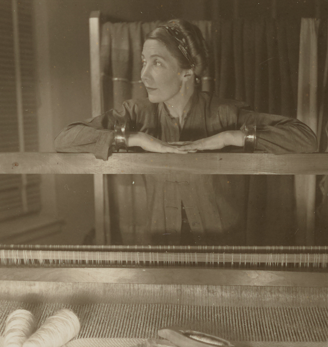
PEOPLE
April 3, 2023
Merging Computer and Loom, a Septuagenarian Artist Weaves Her View of the World
by Francesca Perry
1
THE BUILT ENVIRONMENT
March 27, 2023
Words That Impede Architecture, According to Reinier de Graaf
by Osman Can Yerebakan

1
PEOPLE
March 20, 2023
Painting With Plaster, Monica Curiel Finds a Release
by Andrew Russeth

1
PERSPECTIVE
March 13, 2023
Rules and Roles in Life, Love, and Architecture
by Eva Hagberg
1
Roundtable
March 6, 2023
A Design Movement That Pushes Beyond Architecture’s Limitations
by Tiffany Jow

0
THE BUILT ENVIRONMENT
February 7, 2023
To Improve the Future of Public Housing, This Architecture Firm Looks to the Past
by Ian Volner
0
OBJECTS
February 7, 2023
The Radical Potential of “Prime Objects”
by Glenn Adamson

0
PEOPLE
February 20, 2023
Xiyadie’s Queer Cosmos
by Xin Wang

0
PEOPLE
February 13, 2023
How Michael J. Love’s Subversive Tap Dancing Steps Forward
by Jesse Dorris
0
SHOW AND TELL
February 7, 2023
Finding Healing and Transformation Through Good Black Art
by Folasade Ologundudu

0
BOOK REVIEW
February 13, 2023
How Stephen Burks “Future-Proofs” Craft
by Francesca Perry
0
ROUNDTABLE
February 27, 2023
Making Use of End Users’ Indispensable Wisdom
by Tiffany Jow

0
PEOPLE
February 7, 2023
The New Lessons Architect Steven Harris Learns from Driving Old Porsches
by Jonathan Schultz

0
PERSPECTIVE
February 7, 2023
The Day Architecture Stopped
by Kate Wagner
0
OBJECTS
February 7, 2023
The Overlooked Potential of Everyday Objects
by Adrian Madlener
0
ROUNDTABLE
February 7, 2023
A Conversation About Generalists, Velocity, and the Source of Innovation
by Tiffany Jow

0
OBJECTS
February 7, 2023
Using a Fungi-Infused Paste, Blast Studio Turns Trash Into Treasure
by Natalia Rachlin